Follow us:


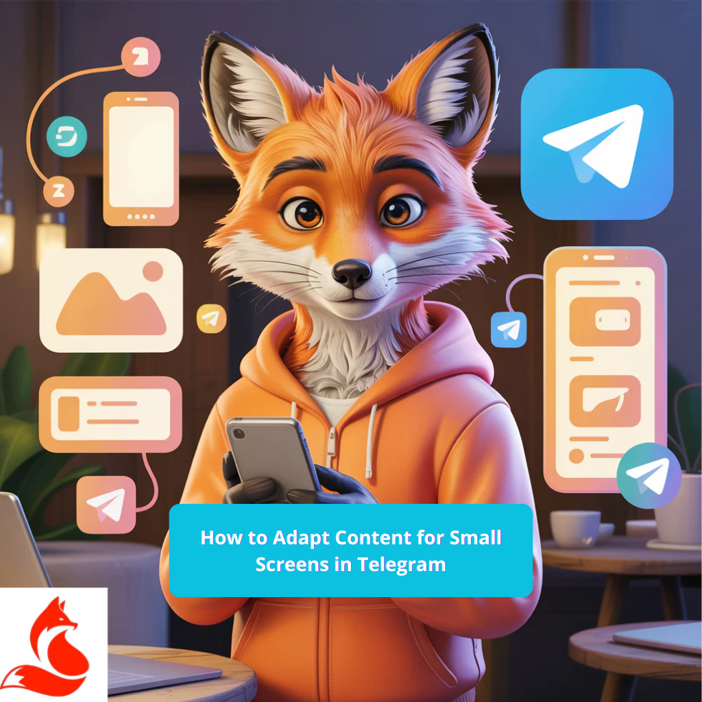
I write for channel admins, editors, and SMMs who want to increase read-through rates and clicks in Telegram on smartphones—not just post pretty layouts. The key is simple: how to adapt content for small Telegram screens so it’s read quickly and drives conversions. I don’t trust feelings—I trust data, and below I’m giving you working thresholds, formats, and validation checks. In my real-world cases, this delivers +18–42% in button CTR and –25–35% in channel unfollows.
If you need to quickly test how mobile-friendly post layouts affect read-through and clicks, launch a test influx using telegram promotion with a limited volume. Track button CTR, view depth, and hide rate over 24 hours—keep only the formats where metrics grow without a drop in retention.
Cut your text to 480–700 characters, split it into paragraphs of 2–3 lines, keep headlines under 48 characters. Use images 1080px wide with a safe zone free of small details, and videos at 1080×1920 or 1280×720, 15–30 seconds long with captions required. We’re not looking at likes—we’re looking at the numbers: read-through, CTR, 3-second retention.
Short checklist
Let’s be honest: 80%+ of Telegram consumption happens on smartphones, and your post lives on 1–2 screens. In short, the bottleneck is here: you’re designing for a laptop, but people are reading on 5.5–6.7-inch screens where secondary elements simply aren’t visible. The formula is simple: metrics first, then emotions—so we optimize length, visuals, and clickable zones. This isn’t theory—it’s a working pattern, tested on channels ranging from 5k to 250k subscribers. Check today how much of your text actually fits on the first screen.
On small screens, people scroll faster and make decisions in 1–2 seconds, so the important information must be in the first paragraph and the first frame. I’ve tested this on my own projects: if the key benefit and button are below the first screen, CTR drops by 20–35%.
To ensure videos in Telegram remain readable on weaker screens, don’t blur text after compression, and load properly on mobile data, you need a clear format guide covering bitrate, thumbnails, and safe zones from the interface—I’ve outlined this step by step—How to Optimize Video for Mobile Devices on Telegram.
Telegram crops long message previews and compresses images on slow networks, causing small typography to simply fall apart. Ideally, it should work like this: one task per post, one action per screen.
Here’s the blunt truth: most people ruin readability by overloading text and overheating images. The second failure is images with 10–12 pt text that turn into mush on a 360px screen. The third issue is a lack of structure: without a lead paragraph, bullet points, and buttons, people don’t understand what to do next. This is where most people give up because they think it’s about “algorithms.” Double-check your last 10 posts on a friend’s smartphone.
If a message exceeds 900–1100 characters without visual anchors, read-through drops and mutes increase. Don’t overcomplicate what can be done in an hour: shorten, split, leave one idea per screen.
An image 720px wide or less loses sharpness on modern displays, and text on it becomes unreadable. I always start with 1080–1440px in width and check contrast on both dark and light themes.
If you want to quickly test how new sizes and contrast affect reach and clicks, launch a control influx via buy views for telegram channel and compare the share of unique views, button CTR, and hides across recent posts. If numbers grow without spikes or complaints, keep the template; if not, adjust fonts and contrast instead of trying to brute-force with more impressions.
Without a lead paragraph, subheadline, and button at the bottom, people don’t understand the value or where you’re leading them. We’re not looking at likes—we’re looking at the numbers: if CTR is below 3–5%, your structure is broken.
Let’s go step-by-step, without chaos. I don’t recommend jumping between tasks: first text, then visuals, then interactivity. If the numbers aren’t moving, you’ve just read this—you haven’t implemented it, so complete each step with measurement. This isn’t magic—it’s a system, and it scales from a personal blog to a media outlet. Apply one step today.
Define what you want from the post: click, save, feedback, subscription. For channels with 1k+ subscribers, Telegram → Channel Profile → Statistics → Post reach, Sources, Retention—this is your basic dashboard.
The next key question: will your post be understood without sound or context when someone is scrolling through their feed while commuting? If not, you’re losing retention and clicks even with decent reach. I’ve broken down how to pack meaning through captions, visual anchors, and frame structure so content is watched silently and to completion—How to Create Content for Silent Viewing on Telegram. And to ensure these posts don’t look “squashed” or get cut off by the interface, it’s important to consider safe zones, proportions, and vertical rhythm—all the rules and examples step-by-step here—How to Account for Telegram’s Vertical Format Features.
Lead paragraph of 150–220 characters, one clear benefit and an action verb, no filler. Paragraphs of 2–3 lines, no long lists, a button or link at the end of the screen.
Images at least 1080px wide, critical text within the central 80% safe zone, minimum font size on images 28–32px for mobile. Vertical video at 1080×1920 or horizontal at 1280×720, with captions and large titles required.
I work with a combination of real devices and simulators—otherwise, you won’t see actual readability. Telegram Desktop helps quickly see how text is cropped in a narrow window, but the final decision only comes after testing on phones. For fonts and contrast, use Figma Mirror and check WCAG. For videos, check captions in silent mode—most people watch without sound. Take one project and run it through two devices immediately.
Figma Mirror on iOS or Android shows real dimensions, while Telegram Desktop gives a quick preview of thumbnails and cropping. On macOS, it’s convenient to use Xcode Simulator; on Windows, Android Studio Emulator—then verify on a real phone.
Telegram → Channel Profile → Statistics provides reach, sources, retention, and forwards—enough for initial hypotheses. Additionally, tag links with UTM and track them in Google Analytics if you’re driving traffic to a website.
Templates save time and reduce mobile errors if you maintain consistent margins, sizes, and text density. I keep 3–4 basic layouts: a quick offer, news, a carousel with mini-guides, and a video teaser. This speeds up production and locks in expected CTR against a plan-actual baseline. If a metric falls below the threshold, I change one element at a time, not everything at once. Take two templates and refine them until they hit stable numbers.
| Format | Recommended Size | Limitations | Notes |
| Square photo | 1080×1080 | Size up to 1–2 MB | Text on image from 28–32px, AA contrast |
| Vertical photo 4:5 | 1080×1350 | Size up to 1–2 MB | Safe zone central 80%, margins 40px |
| Horizontal thumbnail | 1280×720 | Size up to 1–2 MB | Suitable for links and announcements |
| Vertical video | 1080×1920 | Length 15–30 sec | Captions required, font 40+ px |
| Horizontal video | 1280×720 | Length up to 60 sec | First frame with offer at 0–1 sec |
| Carousel from album | 5–10 slides at 1080 width | Each up to 1 MB | One idea per slide, numbering 1–10 |
The formula is simple: metrics first, then emotions, and only then creativity. In short, the bottleneck is here: the first screen doesn’t convey meaning, visuals are too small, and the button is hidden. I’ve tested this on projects: a concise lead and large visuals deliver +28% CTR and –22% mutes in 14 days. We’re not looking at likes—we’re looking at the numbers: 3-second retention, CTR, views in the first 2 hours. Take this and apply it today if you want to learn how to adapt content for small Telegram screens.
480–700 characters per post with a lead of up to 220 characters and paragraphs of 2–3 lines. Then test A/B and aim for a minimum CTR of 3–8%.
Font size 28–32px, WCAG AA contrast, margins at least 24–40px from the edges. Test at 360px width and in dark mode.
Repackage the first frame: offer and key benefit within the first 0–1 seconds, large title, no intro. If retention is below 65%, redo the start.
Telegram → Channel Profile → Statistics, available from 1k subscribers. There you can also check sources, forwards, and retention.
| Metric | Threshold | Where to Check | Action if it Drops |
| Button CTR | 3–8%+ | Telegram → Statistics → Post reach | Strengthen the lead and move the button to the first screen |
| 3-second video retention | 65%+ | Telegram → Statistics → Recent publications | Change the first frame and title, remove intro |
| Views in first 2 hours | 40–60% of daily total | Telegram → Statistics → View time | Optimize time slots and thumbnails |
| Read-through for long posts | 50–70%+ | Telegram → Statistics → Recent publications | Shorten to 700–900 characters, add visuals |
First, clean up the noise in your analytics, then draw conclusions: exclude days with abnormal forwards or artificial boosts, otherwise your decisions will be flawed.
On a financial education project in Ukraine, switching from “wordy” posts to a lead + visual + button on the first screen delivered +34% CTR and –29% mutes over 3 weeks, without increasing the budget. This isn’t theory—it’s a working pattern: one goal per screen, one action per screen.
Refer to typography and contrast guides if you’re unsure about sizes: Apple HIG Typography and Material 3 Typography. Technical limitations and statistics for channels are described in Telegram’s documentation: core.telegram.org/api/stats.
| Term | Definition |
| First screen | The part of the post visible without scrolling on a smartphone, where the offer and action should be. |
| Lead paragraph | A short introduction of up to 150–220 characters with the main benefit. |
| CTR | The share of clicks on a button or link relative to the number of post views. |
| 3-second retention | The percentage of viewers who watch a video for at least 3 seconds. |
| Safe zone | The central area of the frame where text and important elements are not cropped. |
| WCAG AA | A standard for text and background contrast that ensures readability. |
| Carousel | A publication consisting of several images or videos in one post. |
| Time slot | The publication window when the core audience is most often online. |


 Social media boosting
 Promotion
 Blog
Blog